

2023.03.23 Carl Brett part 1
The development of graphic design in Canada has always been an argument in favour of new ideas, and new immigrants. I interviewed one such case in point, Carl Brett, at OCAD University back before it was called that. Brett gave his date of birth as 1928 but other sources differ. (The designer himself is, of course, a credible source but not always the definitive one.) He proved to be an animated and witty interview subject, full of the confident assertion of his work’s place and its importance that is the hallmark of a successful designer. History is often built on contradictory facts, just as design history must reconcile opposing assertions of value.
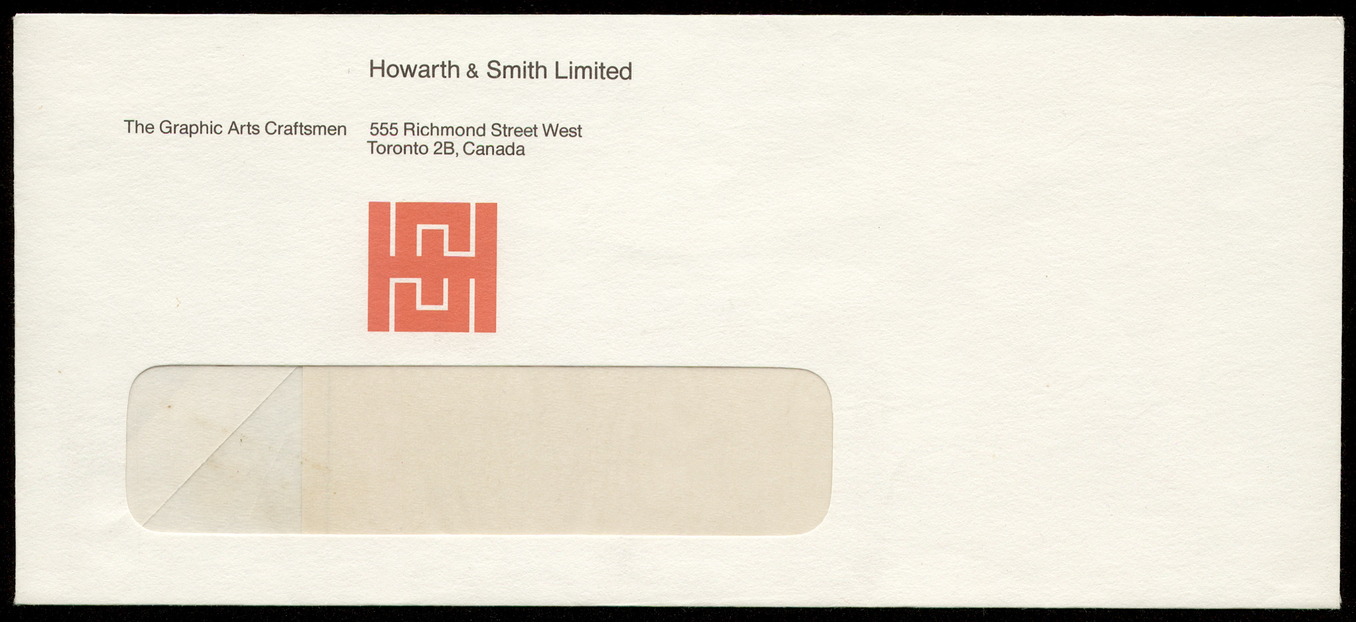
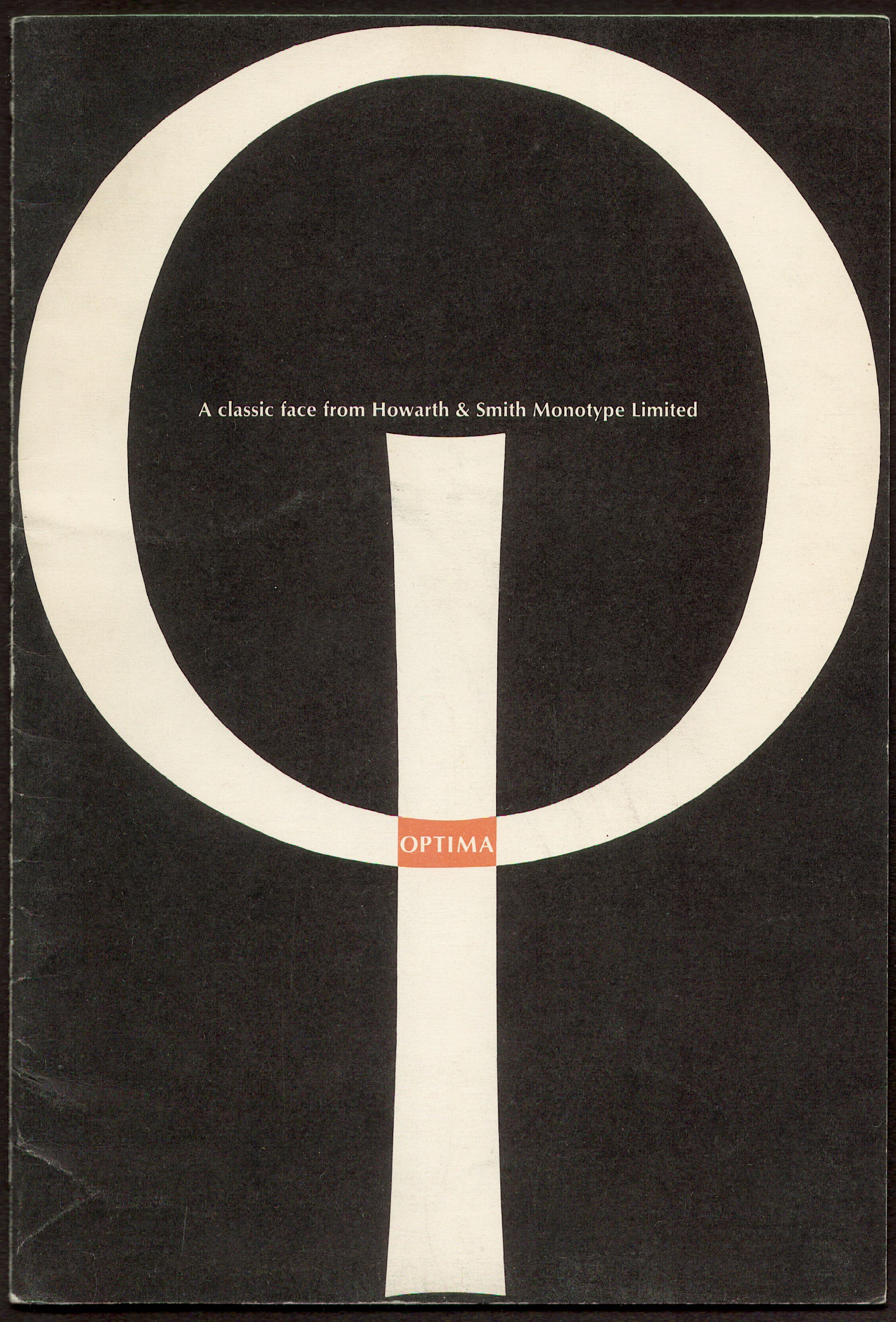
Emigrating from Ireland to Canada in 1954, he worked first in advertising at prominent agency Vickers & Benson, with Stanley Furnival. In 1959 he joined Howarth & Smith, a supplier of the creative typography and design that clients and art directors were increasingly demanding. Brett’s work typically demonstrates a strong sense of typography, structured on a finely balanced and usually asymmetrical modern grid. But as well, he often combined this with striking abstract patterns fashioned from enlarged letters and typographic characters.

The three designs reproduced here demonstrate how such purely visual play with type can become, at its best, arrestingly graphic. But their synergy also vibrates with new if possibly fanciful visual meanings. These examples suggest Irish sources to me, likely rooted in his education at the Crawford School of Art in Cork. A ring of ampersands becomes a contemporary variation on the interwoven, serpentine Celtic Knots from metalwork and illuminated books; the interlocking initials of H and S on an envelope might similarly be seen as an echo of ancient stone carvings and sacred geometries; while the cover of a brochure promoting the typeface Optima combines I and O in an upright figure that hints at the silhouette of an incomplete Celtic cross.
The fourth scan gives us the first page of an apparently unpublished article, possibly the notes for a talk or even a client proposal. In the draft, Brett mentions the “visually sophisticated audience” of readers for the Register. In what would be unusually blunt rhetoric for any client meeting, he pillories the publication for its “archaic appearance, its obvious lack of design and its poor typography,” which “conveys the impression that it is quite out of touch with reality, that it is well behind the times and that it doesn’t know any better.”
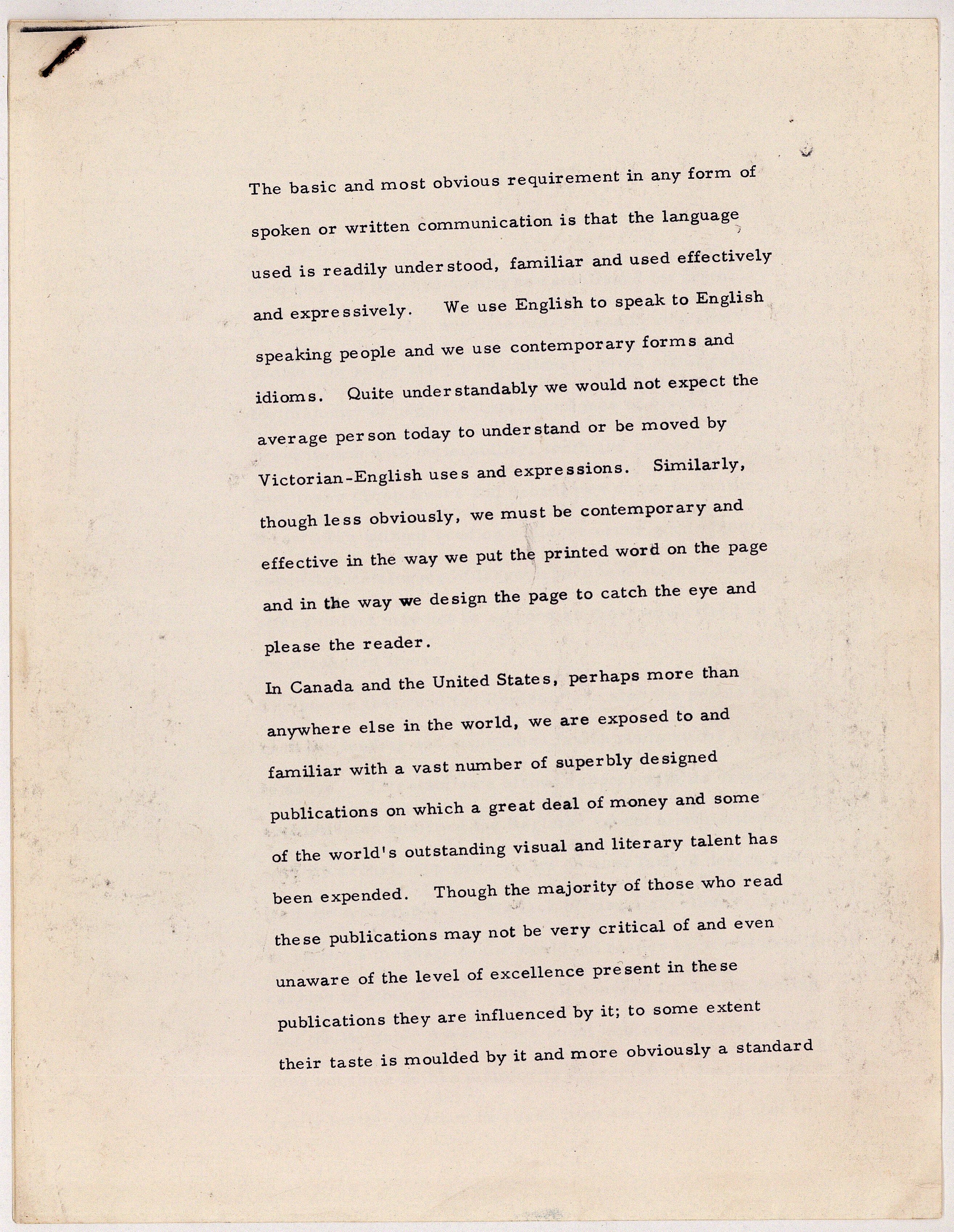
As remedy, Brett emphasizes the need for design to be contemporary, legible, and understandable to a general audience, and insists on the importance of “visual excellence.” But it seems he can’t leave such a positive approach well enough alone, so he proceeds to make the unusual admission that even if the majority of people believe that such “expensive” designs equate with truth and authority, in fact the goods they represent can be inferior to those found in the “cheap flyers and broadsides” we so often and so easily discard. (The demanding personalities behind the most exacting and celebrated designs could make woefully poor salespeople.) The notes are undated; perhaps like carbon dating, the degree of rust on the staple could locate it approximately in time.
There’s a still image of Carl Brett, taken from my videotaped interview (that’s my grizzled chin and left hand, scribbling notes) at: https://eportfolios.capilanou.ca/tinaganguly/2021/04/19/canadian-design-today/
My notes tell me I met the designer at (what was then the College known as) OCAD in Room 627 at 2 pm; but absurdly I didn’t note the actual date. My memory wants to say it was 2005; but I’ve written an entire article about how memory is not history, so I hope to dig up evidence for the actual date eventually. I’m even more hopeful that ccca.ca reappears online soon, as the video was posted there.
The good folks at Canada Modern have a useful portfolio at: https://canadamodern.org/tag/carl-brett/
Brian Donnelly
This blog is intended as an introduction and background to my long-form writings and visual essays, some previously published, some not, and some new, which will find their way onto my website, designhistory.ca. Based on my research into graphic design history in Canada, the site layout is well begun, but no, it’s not quite ready to go online yet. I’ve only recently felt focused again on this project, for one thing, and I’m still learning (which is to say memorizing) the workings of the online, browser-based editing and layout tool—letting it program me, in effect. Bear with me, there’s a lot of material to come.